
Digital Marketing Logo Curation: Brows by Laurie-Ann
- Jenna Cardamone
- Apr 24, 2024
- 3 min read

Updated: May 27, 2024
Brows by Laurie-Ann is a new and local Winnipeg business that has reached for guidance with curating a new brand identity for their clients. In order to best assist this small business owner, I took a thorough in-depth analysis of their current marketing and advertisements, as well as connected with my client on their needs and wants.
My client performs all of their marketing and social media management themselves, and wanted to continue to share their online presence with clients. This allows them to truly showcase their care for their customers on an individual basis, as well as their fun and outgoing personality. Knowing this was key during my brainstorming.
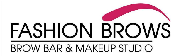
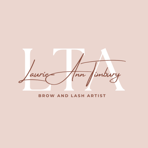
Taking a glance at their previous logo (shown below), they had wanted something classic and subtle. They saw what competitor brow and lash artists used for their logos, and wanted something similar. By following this theme, their business cards blended in with their competition, and potential clients that encountered their business cards, were not clearly shown the differences between the service providers. The main feature that stands out on this card is not what service is provided, but who is providing them. Since new clients do not have customer loyalty, or that the small business owner does not have enough brand reputation to market solely by their name, the business card does not follow through on its intended purpose. Instead, potential clients only see that dark name contrasted on the soft blush card, and do not take time to further look into what the card is for.

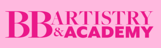
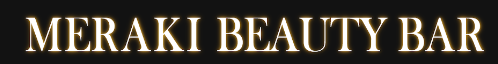
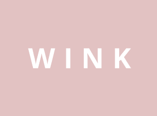
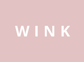
My main goal when creating a logo was to ensure that it is suitable for business cards, which are often only glanced at quickly by potential clients. Since business cards often are given during a conversation or are out on display, having a clear message shown is crucial. In order to stand against the competition, I took a look at other brow and lash artist logos to determine what works, and what to avoid (see below). Most brow artists stuck with fine detailing for fonts, and leaned heavily towards black and whte, or feminine colour schemes. While these logos are all unique and work well for each business, they do not stand out when placed together. This can make it difficult for a potential client to pick which company to do business with, if it seems that they are all providing the same experience. Brows by Laurie-Ann is not the same experience as other brow and lash artists, as her bubbly personality will be sure to make her clients light up with every interaction.


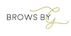

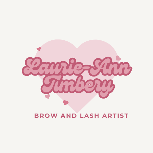
With all of this in mind, I began creating mockup logos to accommodate what my client was originally wanting, and fun and unique logos to showcase her personality. I shared with her a few options (see below).


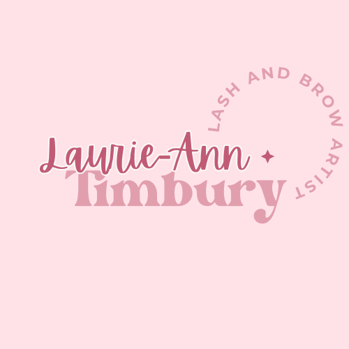

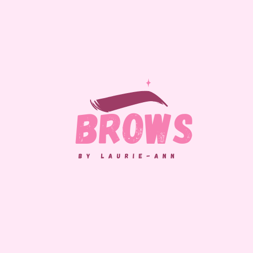

We agreed that the best route would be gender neutral colours, since it showcases inclusivity of her clients being of all genders. Other brow and lash artists do not make it abundantly clear through their logos that they are inclusive, since some use hyper-feminine colour schemes. This allows all clients to feel comfortable choosing Brows by Laurie-Ann for their services, simply from a quick glance at their logo. With the adjustments made to the logo with my clients feedback, I created the final logo (see below).

Once the logo was finalized, I then created a business card, Facebook logo header, and an animated Instagram post to introduce the new brand change (see below).


Overall, it was a wonderful experience helping a local small business owner to help improve upon their current marketing strategy. I look forward to seeing their success with their clients! Best of luck to Brows by Laurie-Ann!
Clients contact:
Instagram @browsbylaurieann


Comments